F.O.U.R. was designed as a multi-surface digital platform supporting a large-scale virtual festival centered on advocacy, participation, and collective action. The project required a flexible system capable of organizing complex, fast-changing content while remaining accessible, legible, and consistent across web, social, and physical environments. Rather than treating the festival as a one-off event, the goal was to design a scalable experience that could support ongoing participation, evolving content, and future iterations without requiring structural redesign.
Large-scale virtual events frequently break down as they scale. As content volume increases and contributors multiply, platforms become fragmented, navigation degrades, and visual systems collapse under real production pressure. For F.O.U.R., the challenge was to design an experience that could support a multi-day festival with frequent updates, a growing number of speakers and submissions, and real-time content changes, all while maintaining clarity, hierarchy, and accessibility. The system needed to perform reliably under fixed timelines, unpredictable content, and cross-platform demands.
Architect, inventor, and co-founder of Notpla Rodrigo Garcia Gonzalez posed a brief aimed at reducing waste in our community and on our collective earth.
TIME’s 2020 Kid of the Year, Author, and STEM Promoter Gitanjali Rao posed a brief aimed at increasing access to knowledge for underserved communities.
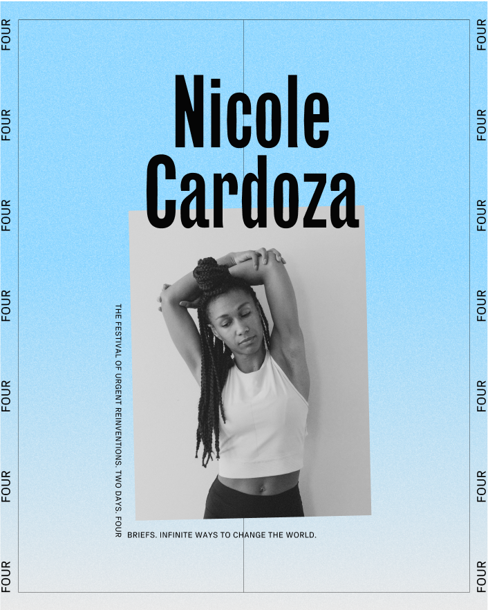
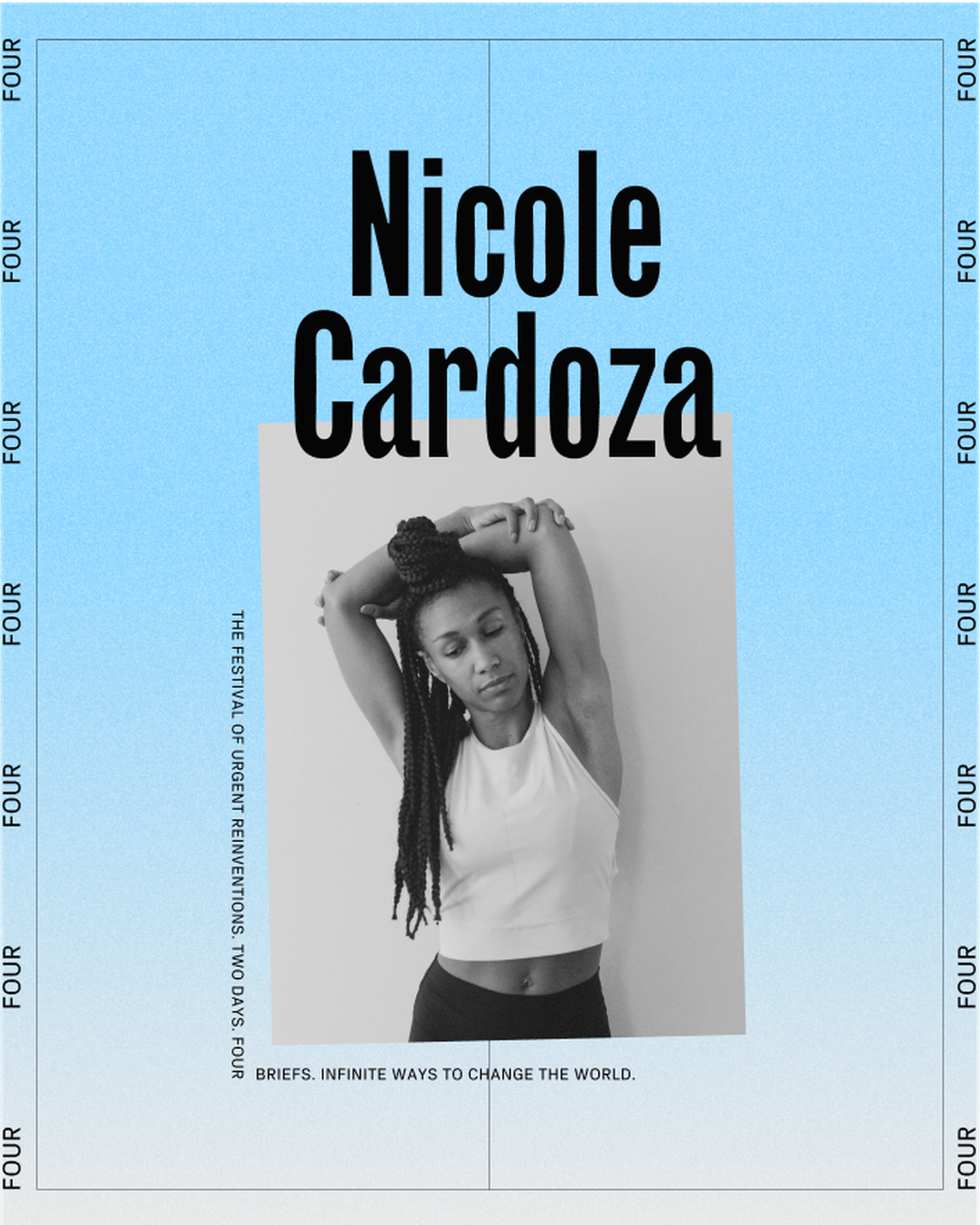
Social entrepreneur, investor and author Nicole Cardoza posed a brief aimed at closing the racial and socio-economic divides in the wellness industry.
Architect, inventor, and co-founder of Notpla Rodrigo Garcia Gonzalez posed a brief aimed at reducing waste in our community and on our collective earth.
TIME’s 2020 Kid of the Year, Author, and STEM Promoter Gitanjali Rao posed a brief aimed at increasing access to knowledge for underserved communities.
CEO and Founder of Beam, Alex Stephany, posed a brief aimed at providing disadvantaged groups in our communities more access to professional mentorship.
Social entrepreneur, investor and author Nicole Cardoza posed a brief aimed at closing the racial and socio-economic divides in the wellness industry.
Users & Goals
The platform served multiple participant groups with distinct needs: Attendees
Attendees needed clear orientation, intuitive navigation, and the ability to explore complex subject matter without cognitive overload. The experience prioritized discoverability and sustained engagement across multiple days. Contributors and Speakers
Contributors required consistent, equitable presentation of their work within a crowded ecosystem. The system needed to support diverse content formats while preserving individual voice and visibility. Organizers and Curators
Organizers needed a framework that allowed rapid updates, schedule changes, and content promotion without breaking consistency or requiring manual redesign. Operational efficiency was critical. Across all users, the primary goal was to create an experience that emphasized access, clarity, and participation while remaining resilient as scale increased.
Constraints
The project was shaped by real-world production constraints that directly informed system design: • Fixed launch timelines and immovable event dates • High variability in content volume, format, and length • Deployment across web, social, and physical environments • Accessibility requirements as a foundational, non-negotiable constraint • The need for reuse across future iterations of the festival These constraints demanded a system optimized for flexibility, durability, and speed rather than idealized or bespoke layouts. System and Layout Strategy
The design system was built to organize complexity without flattening expression. Modular Framework
A modular layout system allowed content blocks to be rearranged, expanded, or replaced without disrupting hierarchy or legibility. This enabled rapid updates and supported unpredictable content growth. Hierarchy and Information Flow
Clear typographic structure, spacing, and scale established consistent reading order across all surfaces. Critical information surfaced immediately, while secondary content remained discoverable without visual noise. Cross-Surface Consistency
Core components and layout logic translated consistently across digital and physical touchpoints. This reduced cognitive load for users and ensured recognition regardless of entry point. Expressive Constraint
Visual expression operated within defined boundaries. Color, motion, and graphic elements were applied systematically to preserve flexibility and reuse while maintaining emotional resonance. Scalability and Reuse
All components were designed for longevity. The system could support future festivals, new themes, and expanded participation without requiring foundational changes.
Four Grid + Yellow Cursor
F.O.U.R. launched as a fully realized virtual festival supporting live programming, contributor participation, and continuous content updates. • The system maintained clarity and navigability as content volume increased. • Contributors retained consistent visibility as participation scaled. • The experience remained cohesive across web, social, and physical surfaces. • Organizers were able to manage real-time updates with reduced production overhead. The project demonstrated how a system-first approach can sustain complex, advocacy-driven platforms beyond a single moment.
.png)
.png)
.png)
.png)
.png)